Monday, 26 February 2018
Website Planning
1. Justify you choices of colour, layout etc on your WIX (use screenshots to illustrate your points).
The major colours included in our website vary between a monochrome background image, and dark crimson red highlights. The decision to use these colours was made due to the films premise being quite dark and dramatic. Consequently, we thought that the website's design should follow the dull and dusky tones of the Mise-en-scene portrayed throughout the film. In the same way, the layout of the website and its navigation is very simple and easy to comprehend. We feel that this was a good choice as it would mean the navigation system wouldn't draw the attention away from the contents of the site, thus using bold, standalone titles to emphasise each page.
2. Discuss what pages are on your site and what is/will be on each page.
The website has 4 main pages: Home, Gallery, Videos, and About. The 'Home' page, as shown above, we tried to make very minimalistic and therefore stand out to the user as it is the landing page of the site. This page includes the group names, the 'Watch Trailer' button, and the major title with release date. The 'Gallery' contains behind the scenes photos from the production, and also some from the production itself. This is the same with the videos page but instead including trailers and more behind the scenes footage. Lastly, the 'About' page is embedded into the bottom of the 'Home' page as we thought it would be a good idea to link the two together. This includes a synopsis of the film, and also the cast and crew list.
Subscribe to:
Comments (Atom)
Cast & Crew
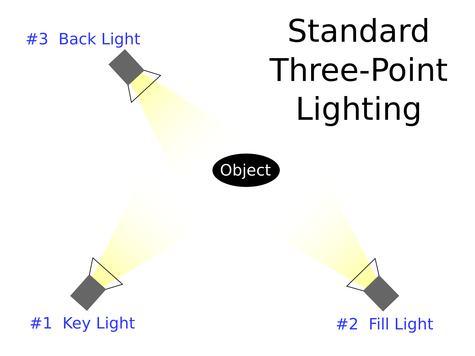
When taking the Cast and Crew photos, we used 3-point lighting. This meant that a key light was facing the subject, a fill light was ...

-
Dialogue is an important code that has the purpose of imparting information to the audience and establishing characters and relationships. T...
-
MANAGEMENT Production Manager Managing the production budget. Making sure the production runs smoothly for the Producer and Line Pro...
-
Title : Critically Comparing my Skills, Processes and Methods 1st. Formulate your question: Look below at what you are you being asked...

